Wednesday, December 30, 2009

Suitcase Mood

I made this drawing as a present for my younger brother Soso on his birthday, which is today, December 30th. For the reference, I have used a photo of him, taken by me in Riga airport, during our transit flight from Vilnius to Tbilisi, in January 2009. Only he wasn't actually sitting on a suitcase. The idea comes from the Russian expressions "sitting on a suitcase" and "a suitcase mood," used when someone is ready and eager to depart somewhere.
The artwork perfectly represents my own mood at the moment: I'm planning to move to Lithuania next month, to finally reunite with Diana and settle down our nomadic marriage. No more suitcases and airports please! Thank you.

As for the drawing itself, it's my usual color pencil/ballpoint pen combination. I have decided to place both my brother and his suitcase (my suitcase, actually) against a clean white background, in the best traditions of Norman Rockwell, which adds to the comic feel of the artwork.

Monday, December 28, 2009

The Mornings After: Wednesday

Another drawing from The Mornings After series. For the details please read my introduction to the series.

Saturday, December 26, 2009

The Banner

With Black Coffee II finished, I have switched to my other series called Paranoia II (or ParanoIIa, as spelled alternatively). For a change, I decided to draw something new this time, not a remake. Well, the concept itself is quite old actually -- I did the rough draft a few years ago -- but still, it's a refreshing break from the long streak of remakes I did in the last few months.

I have nothing much to say about the artwork, except that it also features Diana as the model (what could I do without her!), only in a rather unusual form -- we can see a narrow stripe of her body, attached as a banner to her own... finger! Well, the finger is not exactly hers, but it sounds more bizarre that way -- and not only sounds, but looks as well, as you can see for yourself.

Thursday, December 24, 2009

Black Coffee II: The Complete Series

Inquisition II has concluded the Black Coffee II series, but I still have left a whole bunch of "coffee sketches," as I call them, so I'm planning to begin the third installment of the series next year. Meanwhile, I'd like to showcase some of the best (in my opinion) works from now completed series. But before that, a brief history of my "coffee artwork" -- and what on earth has coffee got to do with it, in the first place.

The answer to that question is simple: all the drawings from Black Coffee series are based on the actual images seen in dried coffee grounds, inside the actual coffee cups drunk by the actual people. I did these coffee drawings on a regular basis since 1993 through 1996, using only black ball-point pen. Most of them were drawn on the pages of a math copybook, properly titled and numbered, but later I started to make just quick drafts on random pieces of paper. Presently the copybook drawings are gathered into the series called Black Coffee With No Sugar, while the quick coffee sketches are collected as Coffee Drafts. On the left you can see my very first coffee drawing, called Golgotha.


The first colored version of a coffee drawing appeared in 1995. It was Mate to the Queen, loosely based on 1993's Regal Execution, seen on the right. It's probably the only case when I have changed the original composition so dramatically -- all the later color remakes follow their black-and-white predecessors as close as possible in that regard.

Mate to the Queen (1995)

The Black Coffee series, based on my earlier black-and-white coffee drawings, was among my first surreal portfolios, along with Body Language and Paranoia. It contains 15 pieces in total, dated from 1995 to 2000. In 2002 I started a new series called Black Coffee II, which has been completed only a few days ago. It also consists of 15 pieces and has some remade titles from the previous series. Here are a few selected works from the now complete series, as promised in the beginning. You might have seen some of them already in my previous blog posts.

Mate to the Queen II (2002)

Mermaid's Dream (2003)

Bride & Widow (2004)

The Original Sin (2004)

Shadows of the Memories (2006)

The Blue Cloud (2007)

The Moonstone (2009)

Nude Beach Dreaming II (2009)

You can see the rest of the works from this series at my website, or my deviantART gallery.

Wednesday, December 23, 2009

The Mornings After: Tuesday

This is the second drawing from The Mornings After series started in September. For the background of the series and the technique details please read my earlier post about the first drawing from the series, called Monday.

Tuesday, December 22, 2009

Inquisition II

This is another remake of my earlier artwork, only this time the gap in time is significantly smaller than it was with previous "coffee remakes" -- the original Inqusition, seen on the right, was made in 2004 and is from the same Black Coffee II series, as its new version.

The concept behind the artwork is quite simple: a woman, presumably accused of witchcraft, is about to be burned. There's nothing much to say here, except that the representation is utterly stylized and theatrical -- the lash-marks are the only "real" details here.

The original version followed the image seen in the coffee grounds as exactly as possible, hence the anatomical irregularities. In contrast, the remake features a live model, which brings more sense of realism, although the setting still stays the same (the only difference is the stump which replaced the table-like pedestal). The torn white dress, exposing the woman's semi-naked back, was changed to something more resembling a peeled-off human skin.

Like all my recent works, Inquisition II also features Diana as the model, but this time I had to change the natural color of her hair to red, as required by the new twist in the concept, according to which the hair seamlessly transforms into the flame. But you can still fully enjoy the view of her gorgeous amber hair in the model study made just before the remake.

Sunday, December 20, 2009

Two Drops of Bloody Ketchup

Recently I entered a vampire artwork contest at ArtWanted.com with my old Vampiric Self-Portrait (a.k.a. Two Drops of Ketchup). I did it just for fun, never expecting to win anything, but to my big surprise it won the 2nd place! The prize is only 10 bucks (crisis, you know), but I'm still very happy, because it's the first time my artwork reaches such a high place in a contest.

So here it is, my "award-winning" self-portrait, made back in 1996. It's done with color pencils, ball-point pens, gouache and Indian ink on paper. The so-called "blood drops" (by the concept, they are just ketchup drops) were made by using a sort of "action painting" -- I dripped highly diluted red gouache from a distance high enough to cause natural splatters, then I slightly tilted the paper for a second to make the drops run down a bit, and let them dry that way. That's why they look so realistic. Of course, I had to post-process the drops with color pencils and ball-point pens to give them the necessary volume.

As for my face, I didn't have a camera back then, so I used a double mirror to draw myself from life. Very archaic method nowadays, but it works quite well, once you get a knack of it.

Friday, December 18, 2009

Nude Beach Dreaming II

As you could have guessed, Nude Beach Dreaming II is another remake of my older artwork. Like Maria Magdalena II, it's also from Black Coffee II series, and it also features Diana as the model (doing the double job actually, because she poses for two figures in this one). On the right you can see the original version, made in 2000. It's the last drawing from the first Black Coffee series (1995-2000). Conceptually, it represents the inner conflict between the desire of sexual freedom and the constraint developed during the years of moralistic upbringing.

In the remake I tried my best to leave the composition and the basic elements intact, because all my "coffee drawings" are based on the actual images seen in coffee grounds and I consider it important to retain the original feel and atmosphere in their remakes. But drawing from life brings its inevitable corrections, so I had to follow the rules of anatomy and make certain modifications.

Combining the realistic and semi-realistic visual elements has always been one of the trademarks of Black Coffee series. With Diana's appearance as the model the contrast between these elements became even more pronounced. From purely artistic point of view it might be considered as a threat to the visual and stylistic integrity, but I'm willing to take that risk just to see how Diana's body fits into the various, often harsh and difficult surreal environments -- and from what I've seen so far, it does just perfectly...

Thursday, December 17, 2009

Sweet Attack II: The Royal Revenge

More sweets! And there's a whole lot of them this time. But don't panic, we're gonna survive this attack just as easily as the previous one, if we stay put and don't get distracted by all those sweetie-pretty wrappings.

But why the royal revenge, you might ask. When describing the epic events of the first Sweet Attack, I mentioned that I had received two identical chocolate orders simultaneously, but from different customers, and I started working on the second one right after finishing the first. The brand name for this second series of chocolates is Samepo, which is Georgian for Royal. As for the revenge, these two brands -- BEST and Samepo -- are competing with each other, so my task was to beat my own design, as required by the second customer, who tempted me with gold and silver. The money was good, and you surely remember my three wives and eleven children (the recurring characters from the previous episodes of my design soap). So I tried my BEST to beat the BEST chocolates (sorry for the pun, I just can't restrain myself).

The key product in this series was a classic tiled chocolate with hazelnuts. I call it "tiled" to distinguish it from the bar-shaped chocolate -- I still can't get over the fact that in English there is no distinction between the Mars-type bar ("батончик" in Russian) and the flat, tiled chocolate ("плитка" in Russian). Did I mention I have a thing for contrastive linguistics? Well, now you know it...

Back to the subject. My primary task here was to make the design as different from the previous one as possible, while retaining the classic looks the both products shared. So, for starters, I gave it a horizontal orientation as opposed to its counterpart's vertical one, seen in the example on the right. Also, I chose a pitch-black background for the area with the brand name, while spotlighting the product representing graphics as vividly as possible, to direct all the attention to the content. On top of that, I designed the digital chocolates and hazelnuts from the scratch, trying to make them look different from the ones used in the previous work. But it wasn't entirely possible, because they shared the same digital technique and came from the same FruitLab.

Still, I think I was able to achieve that goal through the overall representation. While it definitely shows that the two designs come from the same author (you can't completely escape that and that's normal), the difference is quite enough to safely put them together on the shelf, so to speak.

One thing I particularly liked about this order was that, unlike the previous clients, the "Royal manufacturers" didn't try to give their goods the "outlandish" looks -- all the inscriptions were in Georgian, proudly emphasizing the origin of the product.

The next in the series were the two smaller "tiles" (50 grams each) under the sub-brand Kalakuri, which is a popular word used for naming various products, from sausages to vodkas, and its literal meaning ("urban" or "of the town/city") often has little or no connection to the actual product. In this case, it was simply used to distinguish the "weight class" and make the reference easier.

One of these smaller chocolates had the same hazelnuts inside, so basically I just placed the existing graphics into a modified environment. The other one came with raisins, so I had to spend some more time in the above-mentioned FruitLab. I had never dealt with raisins before, so it was fun making them (although they didn't come out quite as convincing as I planned).

There was yet another pair of tiled chocolates, even smaller (only 20 grams). One was called "Coffee Chocolate" (only I was unable to find any coffee in its ingredients) and the other was named "For Kids" (basically meaning there was no cognac or other "grown-up" stuff inside it).

Right in the middle of this chocolate invasion I received another "sweet" order -- this time from an old customer of mine, who had switched from making soft drinks to baking cakes, to my great surprise (and I suspect to his own as well). But that's not all. Coincidentally, his brand also uses the word "royal" -- it's called Nugbari Samepo, meaning "Royal Delicacies" or something like that. As for the order itself, basically it was a box design, but I only needed to make the front and side stickers for it. The contents of the box would vary, so I decided to use a photo of the assorted products in its design.

Funny thing is, I had no camera at the moment, so I had to make the product shot with my N73. This phone has quite a decent built-in camera which has saved my ass many times before. After some editing and tuning the sweets and cakes started to look quite inviting. Below you can see the actual box prototype:

After this "royal interlude" I continued with my chocolate drama. The customers decided to deal the final blow to the enemy with a series of chocolate bars with fruit fillings, six in total. I already had quite a stock in my FruitLab, but I still lacked some specimens, like cherries and apricots, so I had to design them from the scratch. Also, I needed to come up with some idea for the cocoa filling (we had one on the menu). For that I made a modified version of the "caramel ripple" effect which I had used in their competitors' dark chocolate design.

I seriously doubt the other party will ever get on their feet after this carpet-bombing. But if they still do, I'll be glad to switch sides in this "chocolate war" and beat my own design... once again.

Sunday, December 6, 2009

A Tiny Bit of Magic Before Christmas

Well, it's actually quite long before Christmas and even longer if we're talking about the Orthodox Christmas, but still...

This is the front side of an advertising booklet for a real estate brokerage company, introducing their special New-Year offers. It's really nothing special in terms of design, but there's something else I wanted to boast about. You see that snowy scenery with a Christmas tree? Take a good look at it. Feel the frost in the air? Hear the Jingle Bells? Good! Now compare it with the original photo, provided by the client:

There, you have just witnessed a tiny bit of photo-editing magic. And such a "miraculous transformation" is the only option when customers are unable to provide you with proper material to work with. Not that I'm complaining, though -- it was quite a fun working on this one.

Thursday, December 3, 2009

Maria Magdalena II

This is another "Dianization" of my older artwork, this time from Black Coffee series. You can see the original version on the right. It's been done in 2000, but the concept draft has existed since 1996. It was my take on Mary Magdalene, one of the most important women in Christianity. According to Eastern Orthodox belief, she had been a virtuous woman all the way from the beginning, so chaste that the devil thought she might be chosen to bear Christ into the world, so he sent seven demons to sway her from the righteous path.

Interestingly, I wasn't aware of such interpretation back when I did the drawing (inexcusable for an Orthodox Christian, I know), and the connection with it came out completely unintended. But that's the way these "coffee drawings" work -- everything about them is spontaneous and happens on subconscious level, because they are all drawn from the actual coffee grounds, which are supposed to be completely random.

You might ask, what the dog has to do with it. Maybe that's the question for the person who actually drank that cup of coffee, but since I can't really remember who it was, I guess I'll have to answer that myself. Well, in my art (and in life, generally) a dog is a symbol of loyalty and faithfulness, and the chain here should not be considered as means of restraining Magdalena's freedom, but rather a way to keep her feet "on the ground" -- something everybody needs when standing on the edge of a crumbling rock.

So here it is -- the brand new version of Maria Magdalena, featuring Diana as the model. I must say, it takes some courage to pose for such a tough theme, with its controversial and somewhat disturbing imagery. But for me there are no forbidden themes in art, and I'm happy that Diana shares my stance on it. Maria Magdalena II is the first artwork to feature her full frontal nudity, and she managed with grace, beauty and the complete understanding of the subject, for which I'm very grateful.

Monday, November 23, 2009

Sweet Attack

As the year is nearing its end, the local sweet-makers have noticeably livened up. Recently I have received two chocolate orders simultaneously, from different customers. One has already been finished, the other is still in progress.

The completed order consisted of four items in total: chocolate with nuts, classic dark chocolate and two chocolate bars -- one with fruit filling and the other with crème brûlée. But first, I had to come up with the trademark design, something simple but catchy, in tune with the brand name: "BEST Chocolate."

Next, I fired up my FruitLab to produce some "come and eat me"-looking nuts. I already had some experience with peanuts, which really helped. Throwing in some chocolate tiles was a piece of cake... or chocolate, in this case. And here it goes, the BEST chocolate with nuts, ever (according to the manufacturer, that is).

It wasn't that easy with the dark chocolate, though. I couldn't use the pretty nuts as the main attraction this time, and without some eye-candy the "dark" package risked to appear duller than its "nutty" counterpart. Some beautifully spread ripples of dark chocolate would do the trick, and I decided to work in that direction. There were some more or less suitable images in stock, but it contradicted with the "golden rule" I'm diligently trying to follow lately: avoid using stock or clip art as much as possible. So I had to make those ripples myself somehow, and that was no easy task.

Luckily, while searching for the reference images, I stumbled upon this wonderful tutorial on how to make 3D ripples in Adobe Illustrator, completely vector-based but very realistic. I didn't even know Illustrator could do such an amazing effect, and so easily, at that. I tried it myself and the result exceeded my expectations: it was perfect! You can see the fruits of my labor in the finished design below.

Working on the chocolate bars went on a lot easier. I made two identical packages, but with different background colors, inscriptions and the colors of the chocolate fillings. The only challenge here was squeezing in the loads of small technical text, but I used to work as a layout designer for a magazine in my previous life, so that was no problem.


You can't fully evaluate a package design until you see it in action. So here's the prototypes of the actual products, dressed (or rather wrapped) for success.

Monday, November 16, 2009

How to Make a Peanut

Today, children, we will learn how to make a peanut! A digital one, that is. It's really not that hard, provided you have some basic knowledge of any vector graphics tool, like CorelDRAW or Adobe Illustrator.

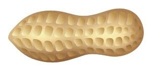
First, we make a simple peanut-like shape, as shown on the right. Then we're gonna need a bitmap texture, like they do it in 3D design, only a lot simpler. Fire up your Photoshop (or any other photo-editor of your choice) to create a rectangle filled with a color suitable for a peanut shell, then take the lighter and darker versions of that color to make light spots and shadows, as shown in my example. It's very simple, you just need large soft brushes to achieve the smooth gradations.

Now just import that bitmap into your vector tool and place it inside the peanut shape we created earlier. Next comes the hardest part: making those notches on the shell. Again, it's not that hard, once you know what you're doing. First, we need to make a few simple shapes, filled with a color gradation, from darker to lighter. Then we need to arrange those shape randomly along the peanut shell, with smaller shapes closer to the edges and in the middle. After that we create a few more rows in a similar way. According to our lighting model, the bottom row should be a bit darker. That's it -- our peanut shell is all ready.
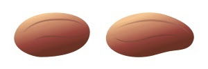
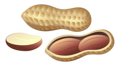
But that's only half the work. Now we need to cut the shell out and place some peanuts inside. For that, we simply make a copy of our peanut shape, fill it with a much darker color cradient, reduce it a bit and adjust its curves to fit its parent, where necessary. Then we need to make another copy of the parent, but this time fill it with a lighter gradation and make it a bit larger than the previous copy, so that it creates an impression of the cut. Look at this -- now we have a huge hole in the shell!Time to make a peanut core. Basically, it's just a nut core, only longer and smoother. Also, it has some evenly distributed, barely noticeable lines along its surface. As for the color, it's reddish brown, and, like in the previous cases, we need a gradation between the darker and the lighter versions of that color.
After the peanuts are ready, all we have to do is place them inside the dark "cavity" we made before. As a finishing touch, we could make a sliced version of the peanut core, but that's optional.
Congratulations, now we have our very own digital peanuts! And they are freely transformable and scalable, like any other vector objects. So what now? We can simply admire our peanuts, gratuitously feed them to some (digital) squirrels or, better yet, use them in a peanut label, like this one: