This design project was finished a couple of weeks ago, but I didn't have time to write a blog post about it. I still don't have much time -- the last two months turned out exceptionally busy for me -- so I'll be as brief as possible.
Since the Russian embargo on Georgian wines, imposed in 2006, our winemakers have been actively trying to enter different markets, but so far they have been able to establish their tangible presence only in Ukraine. Recently that started to change, as Georgian wine companies have begun making more notable advancements in Belorussian market, too.
On that wave, I was contacted by an old customer of mine, who had been away from wine business since the Russian ban. Now he was back in full glory, with a new company and a brand new project aimed exclusively at Belorussian export.
The first thing was to create a trademark which needed to be registered locally. "Retro" was chosen as the brand name, and I was instructed to visualize it by keeping to the beaten track, avoiding any risky experiments. The design had to be approved by both parties -- the Georgian manufacturer and the Belorussian distributor. I offered them several trademark designs and logo font variations, and after some cogitation they decided on the version you can see below. The trademark design is based on traditional Georgian wine-drinking horns, and the logo is based on a heavily modified free font called
Apollo ASM (a small amount of money has been donated to the author). By the way, the font doesn't support Cyrillic, but, fortunately, the word RETRO in Russian can be typed with standard Latin letters -- PETPO.

The next thing was to develop three different series of labels under this brand. The first series were to be made for Alazani Valley wines and had to feature a drawing of a traditional Georgian wine-related scenery, so it was high time for employing my artistic skills. Since I was given a restricted time frame, I decided to draw only the line-art traditionally and color the drawing digitally after scanning. Here's the result:

And below are the labels featuring that artwork. You might notice that I have changed the color of the grapes for the white wine label.

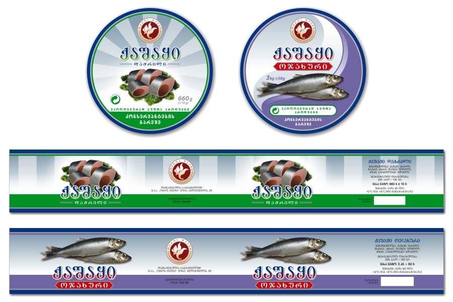
The leading inscriptions on the labels (and all the information on back labels) are in Russian, not in the native Belorussian (although similar, they are still different languages), which is rather strange, given the strict requirements the manufacturers have to meet when designing their products for the local market. See that huge size of the alcohol percentage and the volume? Long live the Belorussian bureaucracy, which surpassed even the Russian one!
The second series of labels consisted of dry wines, and the client wanted a more reserved style for them. Here's the result:

The third series consisted of red semi-sweet wines (namely Akhasheni and Kindzmarauli) and had to be based on an existing design. Since the labels were derived (legitimately, of course) from another artist's work, I don't feel comfortable with posting those samples here.
Okay, folks, I honestly tried to be brief here, but I got carried away, as always. I really need to learn how to write short blog posts. Any training courses on that?

 The client wanted different hand-made artworks for each label, so it was high time for unleashing my "Kakhetian fantasies" -- the wine-related drawings I usually do for my wine labels. As a result, below you can see some of the drawings made exclusively for this project -- namely, the ones used in the dry wine labels.
 Now as I had the trademark and the drawings, all that I needed to do was bringing them together into a label design. Below you can see the result:
 For the semi-sweet wines the client wanted the same composition, but darker, more saturated colors. Naturally, the artworks also had to be in different style, more suitable for the "heavily colored" settings.
 Everything went nice and smooth, until it came to the point of the approval from the Belorussian distributor. We had some experience from the previous project concerning the Belorussian bureaucracy in regard to the product design standards, but, apparently, they had more rabbits hidden up their sleeves than we thought. The distributor approved all the labels, except Pirosmani -- a red semi-dry wine named after the famous Georgian painter Niko Pirosmani. The problem was in the drawing I made for it, which depicted a traditional Georgian festive scene in the spirit of the above-mentioned painter. As it turned out, the advertisement law of Belarus explicitly prohibits featuring any images of humans or animals in alcoholic beverage advertisement, as well as displaying the alcoholic beverages themselves and the process of their consuming. When I pointed out that the advertisement restrictions could not be applied to the product design itself, they replied that while the law didn't affect the product design requirements directly, there were numerous supplementary decrees, resolutions, state standards, and so on, which they had to comply with, so they didn't want any complications.
 There was nothing we could do, so I had to replace the drawing with a different one, similar to the other labels, but with no Pirosmani-related motives. (You can see the replacement drawing on the right.) It's a real shame when some irrelevant requirements force designers to put their creativity on a leash in order to comply to the rules.