If you follow my blog you probably know that I got a full-time job as a postage stamp designer in 2012. Our company specializes in designing, producing and distributing postage stamps mainly for African countries. In more than three years of working on postage stamps I've accumulated quite a collection of design materials. You can stumble across them on
our website, on Ebay, by simply googling for African stamp images, but nobody actually knows they're mine. So I guess it's time to start introducing some of my postage stamps to the world as my works. People have a right to know what on earth I was doing for the past three years, after all.
So, this is my very first postage stamp. It's a so-called super stamp (SS) dedicated to the 85th anniversary of Marilyn Monroe. I didn't have much skills with the Wacom tablet back then, so I heavily relied on Photoshop filters like Pixel Bender. The only thing in this design where you can actually see my "tabletwork" is that golden statue of Marilyn, inspired by the Oscar she never received.
And this is my first traditional 4v + SS (four stamps plus super stamp) work. Nothing much, just some African butterflies. Again, no actual tablet skills to be seen here, just more Pixel Bender. I mean, who needs over-painting butterflies, anyway – they are pretty enough as they are.
I think this Whitney Houston tribute was my first work where I actually started showing tiny gleams of hope as a digital artist, but still I had miles to go.
Ah... the Ancient Egypt... who can resist its charm? Nobody actually cares about digital techniques as long as there is some Tut and Nef to be seen...
Sometimes we do so-called "art themes," which basically means we put some paintings inside the stamps. Virtually no tablet skills are required for this, but it still takes some design work. I think Tingatinga was my first art-related project.
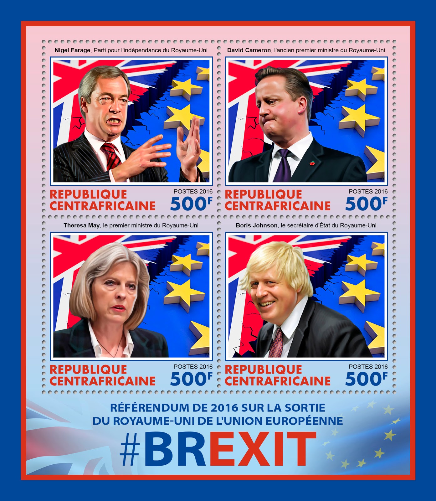
But mostly we do celebrities, like Queen Elizabeth II, for instance. Expectedly, they are selling really well.
And scientists and inventors, of course. They are also quite popular. Not as popular as Popes, but still...
Also, there are some "problematic" themes, like fighting malaria, for instance. Featuring stuff like that in postage stamps increases global awareness to the problems and generally is good for your karma.
And, of course, we remember you, Amelia! How could we forget the first woman who flew across the Atlantic. By the way, this particular monochromatic version was never actually printed, it was changed to a more cheerful colored version, which wasn't really how I intended to handle this theme. Well, such things happen quite often in our business, unfortunately. People prefer colorful stamps. Period.
And, finally, my favorite early work. For some people people it would be just another art theme, but for me it was very important, because the artist in question was none other than Salvador Dali himself. As a surrealist, I basically worship the man, so I really tried my best when working on my first stamp issue dedicated to him.
But funny thing happened with the SS on this one. Back then I didn't know that Togo (the country which ordered the issue) doesn't approve any kind of nudity in their stamps, so I was dumbfounded when they asked to do something about the naked Dali in the super stamp artwork. Our art manager advised to dress him up, so I did exactly that: I painted a leopard-skin dressing gown in the spirit of the famous artist. It fitted nicely and the project was saved!
OK, I think it's enough stamps for one day. Expect more in the future, though – there's a lot more where they came from.


