 Every self-respecting designer hates cliparts and I am no exception. But, despite my hate, I have to use them on a daily basis, like many others do. This is mostly because the evil customers rarely present us with the opportunity to work on our leisure, limiting us with ridiculous deadlines and never giving enough money. Or maybe we're just a lazy bunch of people, spoiled by digital technologies. In any case, I'm not here to sermonize, but to share my experience in trying to deal with the problem.
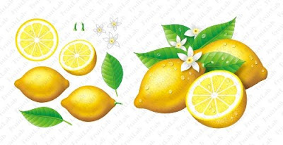
Last year I came up with the idea of creating my own cliparts, or rather the "prefabricated ingredients" for my design works. In reality, it would be a collection of raster and vector "body parts", allowing various combinations when assembled together. I called it FruitLab, because it's primary objective was to provide me with "assembled fruits" for soft drink labels, which is where I use the cliparts most.
I had attempts to grow my own "garden of fruits" long before that. I often made outline drawings, scanned them into computer and colored them. Sometimes I even drew the separate elements entirely by hand and combined them together with graphics software to achieve some variety. But this approach was very time-consuming and hard to use on a regular basis. FruitLab, on the other hand, was entirely digital and more flexible, as it provided with a significantly larger amount of basic elements, allowing to get a lot of different combinations much quicker than the old methods.
The only disadvantage of FruitLab is that the fruits look somewhat simplified, which is because they are digital from the scratch. A graphics tablet would do the job nicely here, but unfortunately I still don't have one. It's a shame, I know, but I'm working on that.
Meanwhile, here are some examples of my FruitLab cliparts, demonstrating both the "ingredients" and the assembled combinations, as well as their subsequent usage in actual design works.


0 comments:
Post a Comment