Monday, November 23, 2009

Sweet Attack

As the year is nearing its end, the local sweet-makers have noticeably livened up. Recently I have received two chocolate orders simultaneously, from different customers. One has already been finished, the other is still in progress.

The completed order consisted of four items in total: chocolate with nuts, classic dark chocolate and two chocolate bars -- one with fruit filling and the other with crème brûlée. But first, I had to come up with the trademark design, something simple but catchy, in tune with the brand name: "BEST Chocolate."

Next, I fired up my FruitLab to produce some "come and eat me"-looking nuts. I already had some experience with peanuts, which really helped. Throwing in some chocolate tiles was a piece of cake... or chocolate, in this case. And here it goes, the BEST chocolate with nuts, ever (according to the manufacturer, that is).

It wasn't that easy with the dark chocolate, though. I couldn't use the pretty nuts as the main attraction this time, and without some eye-candy the "dark" package risked to appear duller than its "nutty" counterpart. Some beautifully spread ripples of dark chocolate would do the trick, and I decided to work in that direction. There were some more or less suitable images in stock, but it contradicted with the "golden rule" I'm diligently trying to follow lately: avoid using stock or clip art as much as possible. So I had to make those ripples myself somehow, and that was no easy task.

Luckily, while searching for the reference images, I stumbled upon this wonderful tutorial on how to make 3D ripples in Adobe Illustrator, completely vector-based but very realistic. I didn't even know Illustrator could do such an amazing effect, and so easily, at that. I tried it myself and the result exceeded my expectations: it was perfect! You can see the fruits of my labor in the finished design below.

Working on the chocolate bars went on a lot easier. I made two identical packages, but with different background colors, inscriptions and the colors of the chocolate fillings. The only challenge here was squeezing in the loads of small technical text, but I used to work as a layout designer for a magazine in my previous life, so that was no problem.


You can't fully evaluate a package design until you see it in action. So here's the prototypes of the actual products, dressed (or rather wrapped) for success.

Monday, November 16, 2009

How to Make a Peanut

Today, children, we will learn how to make a peanut! A digital one, that is. It's really not that hard, provided you have some basic knowledge of any vector graphics tool, like CorelDRAW or Adobe Illustrator.

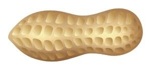
First, we make a simple peanut-like shape, as shown on the right. Then we're gonna need a bitmap texture, like they do it in 3D design, only a lot simpler. Fire up your Photoshop (or any other photo-editor of your choice) to create a rectangle filled with a color suitable for a peanut shell, then take the lighter and darker versions of that color to make light spots and shadows, as shown in my example. It's very simple, you just need large soft brushes to achieve the smooth gradations.

Now just import that bitmap into your vector tool and place it inside the peanut shape we created earlier. Next comes the hardest part: making those notches on the shell. Again, it's not that hard, once you know what you're doing. First, we need to make a few simple shapes, filled with a color gradation, from darker to lighter. Then we need to arrange those shape randomly along the peanut shell, with smaller shapes closer to the edges and in the middle. After that we create a few more rows in a similar way. According to our lighting model, the bottom row should be a bit darker. That's it -- our peanut shell is all ready.
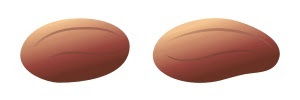
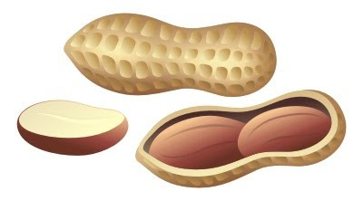
But that's only half the work. Now we need to cut the shell out and place some peanuts inside. For that, we simply make a copy of our peanut shape, fill it with a much darker color cradient, reduce it a bit and adjust its curves to fit its parent, where necessary. Then we need to make another copy of the parent, but this time fill it with a lighter gradation and make it a bit larger than the previous copy, so that it creates an impression of the cut. Look at this -- now we have a huge hole in the shell!Time to make a peanut core. Basically, it's just a nut core, only longer and smoother. Also, it has some evenly distributed, barely noticeable lines along its surface. As for the color, it's reddish brown, and, like in the previous cases, we need a gradation between the darker and the lighter versions of that color.
After the peanuts are ready, all we have to do is place them inside the dark "cavity" we made before. As a finishing touch, we could make a sliced version of the peanut core, but that's optional.
Congratulations, now we have our very own digital peanuts! And they are freely transformable and scalable, like any other vector objects. So what now? We can simply admire our peanuts, gratuitously feed them to some (digital) squirrels or, better yet, use them in a peanut label, like this one:

Monday, November 9, 2009

The Queen of Mermaids

This is an old artwork from my fantasy series, but it had never been published on the Web before, because it hadn't been entirely finished. A few days ago I finally managed to find some time (after eight years!) to sit down to it and get it done. At long last.

Essentially, it's a color remake of a 1994 drawing with the same title from the copybook called Graphic Fantasies. You can see the original artwork on the right. Initially I intended to repeat it's arched shape, but later I changed my mind. I've kept the basic composition and the details of the scenery mostly intact, but altered the mermaid's posture from relaxed to more solemn, living up to her title of the queen. Also, I've changed the throne to some sort of an "epic-looking" rock formation, more suitable for the underwater fantasy setting.

Sunday, November 8, 2009

Sausages. Lots of Sausages.

First of all, let's clear some things up. The English word "sausage" refers to all types of sausages, while in many other languages (like Georgian or Russian, for instance) there are two separate words: one for the large and medium sized sausages, and the other for the small ones, also called Vienna sausages, frankfurters or weenies in English. Since this post covers both types, I need to distinguish them somehow, because they really are different products both visually and gustatorily, so let's simply call them "big" and "small."

I've been working as a graphics designer since 1995, but I did my very first sausage design only in 2003, which, my dear Watsons, lets you safely deduct that this particular industry hadn't been exactly thriving in Georgia until more recently. The big sausages were mainly imported from Russia, while the local manufacturers concentrated mostly on smaller ones -- like those they put in hot dogs.

The local brands of these small sausages (most notably, Iveria and Vake) were hugely popular in Georgia, but their manufacturers never really cared how their products were represented on the shelves: they just dropped the bulks of chained sausages into the fridges and were happy. That started to slowly change lately, as more competitors appeared on the market -- both local and from abroad. So the local sausage-makers finally started to notice us, designers.

My first "sausage order" came from Loma, now retired foodstuff company. It was a box for a cervelat, flavored with tarragon and mint. They never actually released the product due to some technical complications, but still, here it is...

A couple of years later, a newly emerged manufacturer called Akhali Produkti ("New Product") literally heaped me up with a whole series of sausages. They were mostly based on popular Russian (or rather Soviet) sorts, like "Doktorskaya" and "Lyubitelskaya," but also included a few local brands.

The pinnacle of AP's production was a special sort of sausage called "Manuel's Recipe," named after a then popular Spanish chef cook hosting a local culinary TV show.

After that I had a long break from the sausages -- right until 2007, when another new customer knocked at my door: a Gori-based meat products company called Okros Tevzi ("Goldfish"). This time it was different, because the labels were to be printed directly on the sausage coating, and with the applicable printing technology (flexography, to be precise) still being in the embryonic stage here in Georgia, it provided additional challenges from the designing point of view.

Fortunately, the customer soon realized, that the quality of the local flexography just wasn't enough for the proper representation of their products, so they finally switched to my favorite offset printing, ordering me a series of stickers for their main brands.

Last month I received another order from Gori for their new line of small frozen sausages in vacuum packs, three labels in total: Chicken, Milky and For Kids. All three products were sized and packed identically, but since their ingredients and target markets were different, the customer requested three separate designs.

That's it for now. This particular sphere of design still remains largely unexplored for me, and I'm definitely looking forward to more "sausage orders."