Tuesday, November 30, 2010

More Wines

Last month I did labels for a series of wines exported to Belarus, brand-named Retro. A couple of weeks ago the client ordered me a new series of wine labels, also for Belorussian export, but with a different brand-name: Salkhino. As in the previous case, I started with the trademark design. I did something in the spirit of the previous project, but with more "geometrical" approach. The logo font is largely based on a Cyrillic version of ITC Anna, although it's been heavily modified to fit the design requirements.

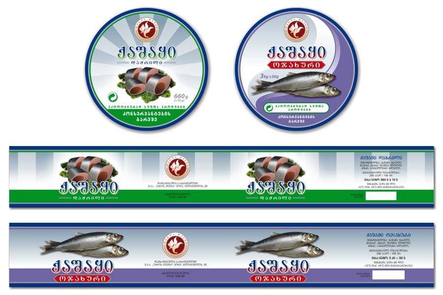
The client wanted different hand-made artworks for each label, so it was high time for unleashing my "Kakhetian fantasies" -- the wine-related drawings I usually do for my wine labels. As a result, below you can see some of the drawings made exclusively for this project -- namely, the ones used in the dry wine labels.

Now as I had the trademark and the drawings, all that I needed to do was bringing them together into a label design. Below you can see the result:
For the semi-sweet wines the client wanted the same composition, but darker, more saturated colors. Naturally, the artworks also had to be in different style, more suitable for the "heavily colored" settings.
Everything went nice and smooth, until it came to the point of the approval from the Belorussian distributor. We had some experience from the previous project concerning the Belorussian bureaucracy in regard to the product design standards, but, apparently, they had more rabbits hidden up their sleeves than we thought. The distributor approved all the labels, except Pirosmani -- a red semi-dry wine named after the famous Georgian painter Niko Pirosmani. The problem was in the drawing I made for it, which depicted a traditional Georgian festive scene in the spirit of the above-mentioned painter. As it turned out, the advertisement law of Belarus explicitly prohibits featuring any images of humans or animals in alcoholic beverage advertisement, as well as displaying the alcoholic beverages themselves and the process of their consuming. When I pointed out that the advertisement restrictions could not be applied to the product design itself, they replied that while the law didn't affect the product design requirements directly, there were numerous supplementary decrees, resolutions, state standards, and so on, which they had to comply with, so they didn't want any complications.

There was nothing we could do, so I had to replace the drawing with a different one, similar to the other labels, but with no Pirosmani-related motives. (You can see the replacement drawing on the right.) It's a real shame when some irrelevant requirements force designers to put their creativity on a leash in order to comply to the rules.

Thursday, November 25, 2010

How Much Is The Fish?

No, it's not about Scooter, it's ofFISHially my first blog post about fish products design. It had been quite a while since I had done such work, so I was pretty excited when I received the order (two similar orders from different customers, actually, but we'll get to that later).

Near the end of last month I was contacted by an old client of mine -- a company which hadn't been working with me for a few years due to the management change and other stuff unimportant to the reader. It was sort of a return of the prodigal son and I gladly agreed to work with them again, because we had done some good stuff together years back.

First things first -- we needed a trademark for their new brand, Oceanida. Not to confuse with the sea mollusks -- they actually meant an Oceanid from Greek mythology, but the thing is that both words are spelled as "okeanida" in Georgian, so they chose to spell the English part of the brand accordingly. They didn't give me complete freedom on this: they wanted a certain type of imagery, while my task was to realize their ideas and come up with an optimal manifestation for them. It all resulted in quite a beaten kind of a logo, nothing really original -- but, hey, as long as the customer is happy, who am I to whine?

So, the next task was to create a side label for a caviar tin can. In fact, it was to be printed directly on the can. They wanted a minimalistic style for that, but still allowed me to cheer up the things a bit by throwing in some digitally cultivated grains of caviar. Anyway, here's the result -- a Georgian caviar! And here I was thinking that stuff was being harvested only in northern seas. Or maybe they are importing it from somewhere else -- there was no indication of that on the label and I didn't pry into details.

Next we had salted herring, and lots of it (8 kilos in a large white plastic can, to be precise). I only needed to cover the sides of the can, not the top. The first demos were brutally rejected and for a quite long time we were unable to reach a solution that would please everyone. Then, finally, I managed to "give birth" to an "all-pleaser" which I proudly present below. I also did a rough 2D simulation of the actual product to have a better idea what it would look like on the shelf.

Somewhere in the process of making this herring, I was contacted by another old customer of mine, who, coincidentally, also wanted to order a herring can design. Interestingly, the company is called Okros Tevzi ("goldfish"), but they had been working exclusively with the meat products before and it was the first time they had actually decided to make "something fishy."

They made two separate orders -- one for a larger can with whole herrings and another one for a smaller can with cut herrings. I was unable to find any cut herring to my liking in stock images, so I decided to cut the fish myself. Here it is -- both cut and uncut:

The designs for both customers haven't been printed yet, it's in the process. Hopefully, everything's gonna be alright, they will sell lots of it and come back with more fish orders. I like fish!

Sunday, November 21, 2010

Sea Paradise

These labels were sent to the printer almost a month ago, but I'm posting them only now. I've been very busy lately, but to be completely honest, I simply forgot about them. Now my memory is back and I'm writing this post.

There is a restaurant in Tbilisi, called Zghvis Samotkhe ("Sea Paradise"). They have their own brand of aerated refreshing drinks, called the same name and bottled exclusively for them, which is a common practice in Georgian restaurants. I had done quite a few label designs for such "restaurant lemonades" in the past, and this was just another order in that line.

As they usually do, the owner wanted me to match the labels with his restaurant's visual style, so I studied some photos before setting to work. The restaurant has a "traditional Georgian" setting, which is a highly popular cliche for such mid-level establishments. I was unable to find anything sea-related on the photos, except the facade stonework reminding beach pebbles, which I heavily utilized in the design.

This month has been quite fruitful in terms of design (which, unfortunately, hasn't left much room for art), so stay tuned -- more design stuff is coming soon.

Wednesday, November 3, 2010

Retro Wines

This design project was finished a couple of weeks ago, but I didn't have time to write a blog post about it. I still don't have much time -- the last two months turned out exceptionally busy for me -- so I'll be as brief as possible.

Since the Russian embargo on Georgian wines, imposed in 2006, our winemakers have been actively trying to enter different markets, but so far they have been able to establish their tangible presence only in Ukraine. Recently that started to change, as Georgian wine companies have begun making more notable advancements in Belorussian market, too.

On that wave, I was contacted by an old customer of mine, who had been away from wine business since the Russian ban. Now he was back in full glory, with a new company and a brand new project aimed exclusively at Belorussian export.

The first thing was to create a trademark which needed to be registered locally. "Retro" was chosen as the brand name, and I was instructed to visualize it by keeping to the beaten track, avoiding any risky experiments. The design had to be approved by both parties -- the Georgian manufacturer and the Belorussian distributor. I offered them several trademark designs and logo font variations, and after some cogitation they decided on the version you can see below. The trademark design is based on traditional Georgian wine-drinking horns, and the logo is based on a heavily modified free font called Apollo ASM (a small amount of money has been donated to the author). By the way, the font doesn't support Cyrillic, but, fortunately, the word RETRO in Russian can be typed with standard Latin letters -- PETPO.

The next thing was to develop three different series of labels under this brand. The first series were to be made for Alazani Valley wines and had to feature a drawing of a traditional Georgian wine-related scenery, so it was high time for employing my artistic skills. Since I was given a restricted time frame, I decided to draw only the line-art traditionally and color the drawing digitally after scanning. Here's the result:

And below are the labels featuring that artwork. You might notice that I have changed the color of the grapes for the white wine label.
The leading inscriptions on the labels (and all the information on back labels) are in Russian, not in the native Belorussian (although similar, they are still different languages), which is rather strange, given the strict requirements the manufacturers have to meet when designing their products for the local market. See that huge size of the alcohol percentage and the volume? Long live the Belorussian bureaucracy, which surpassed even the Russian one!

The second series of labels consisted of dry wines, and the client wanted a more reserved style for them. Here's the result:
The third series consisted of red semi-sweet wines (namely Akhasheni and Kindzmarauli) and had to be based on an existing design. Since the labels were derived (legitimately, of course) from another artist's work, I don't feel comfortable with posting those samples here.

Okay, folks, I honestly tried to be brief here, but I got carried away, as always. I really need to learn how to write short blog posts. Any training courses on that?

Sunday, October 3, 2010

Levan May Cry

A couple of years ago my good friend and business companion asked me to draw a portrait of his son. Last year, when I still lived in Georgia, we took some photos of Levan (that's the name of the boy) to be used as the reference for the future artwork, where, as we decided after some brainstorming, he would be "cosplaying" Nero, the main character from Devil May Cry 4, one of Levan's favorite videogames.

My own son, Sandro, who happens to be Levan's friend, also participated in that photo-session -- I try to kill two birds with one stone whenever I can. That's when I got the idea of a double portrait featuring Levan and Sandro. I liked that idea so much that I postponed Levan May Cry and immediately started working on The Little Heartbreakers, planning to finish this "side project" very quickly and proceed with the "main thing" right after that. But, as it often happens with me, the work dragged out -- I was able to finish the double portrait (seen on the right) only in May 2010, when I had already moved to Lithuania. By that time I had so many other things to do that I had to forget about Levan May Cry for a while.

A couple of weeks ago I finally found time to sit down to it. I couldn't linger any longer -- the kid was growing up, after all. Besides, my mother was coming to visit us by the end of September, so it was a perfect time to finish the drawing and send it to Georgia with her.

Initially I intended to use my usual combination of color pencils and ballpoint pens on this, but then I changed my mind and decided to make it through only with color pencils, like I did with The Little Heartbreakers. It would serve as another proof that I can draw pictures without the help of the "magic" ballpoints.

As the reference for Nero's costume and his famous grotesque arm (replicating those textures was no piece of cake, I must say) I used some game poster found on the Web. Since the character has white hair, I had some reservations about the perspective of Levan's brown hair turning all white. But, as the work progressed, all my doubts dissipated: the white-haired Levan looked quite convincing -- maybe, in part, thanks to the slightly oriental shape of his eyes, very suitable for all this "Japanese fantasy slasher" thing.

I usually try to distribute the basic colors and shades right from the beginning, developing all the important parts of the drawing as evenly and simultaneously as possible. It helps keeping the control over the drawing. But in this case, as you can see from the WIP shots above, I chose to proceed from top to bottom, almost entirely finishing one part, before switching to another. This way I successfully avoided soiling the artwork with my own hands dirtied while working on the areas with dark, intense colors, quite prevalent in this drawing.

As you may know, I'm using a new signature since 2010, with no date under it. But, as requested by Levan's father, I signed and dated the artwork with my old signature. I was able to finish and scan the artwork in the nick of time -- just 15 minutes before the taxi for the airport arrived. As I'm writing this post, the drawing is flying in my mother's suitcase from Vilnius to Tbilisi, where Levan is waiting for it impatiently...

Friday, August 27, 2010

My First Lithuanian Orders

I've been living in Lithuania since the end of January, which makes it six months already, but I still haven't managed to establish myself as a designer in the local market, so to speak. No big surprise -- nobody knows me here, and starting things from the scratch is always hard. Still, after some fishing in the local Web I was able to catch me a couple of fresh Lithuanian customers. About time!

The first was a basketball-related organization called Krepšinis tau (meaning "basketball to you"). They contacted me by the end of July about modifying their existing logo for usage on blanks and other documents, and possibly creating a new one, if I managed to beat the current logo. Alas, the logo managed to beat me instead, although I tried really hard -- several dozens of different demo versions can confirm that. Yet, we managed to develop the print-optimized version of the logo (I don't feel comfortable with posting the visual sample here, since it's based on other designer's work). Also, the customer chose one of my versions (seen below) for possible alternative usages -- like web-banners, for instance.

The first pancake is always lumpy, as Russians say. Fortunately, the second pancake... er... order went with a swing. It wasn't exactly an order, though -- I won a logo contest on some local job-related website. The logo was for a company which rents and sells cars, and the client chose one of my versions.

Not much, I know, but still not bad -- I've done my first Lithuanian design jobs and pocketed (metaphorically) some local currency! Hopefully, there will be more of it... the works, I mean. And the money, of course -- designers need to eat, you know...

Tuesday, August 24, 2010

The Persistence of Khinkali

Everything started with... my avatar. Yes, the one with a melting khinkali on it. I made it about 5 years ago just for fun, but presently I'm using it as my "official" avatar everywhere: on this blog, on my deviantART profile, at ArtWanted.com and many other art or design-related websites, forums, etc. The avatar itself is an entirely digital work -- I took a fragment of Salvador Dali's famous The Persistence of Memory and digitally painted a khinkali over it, replacing the melting clock.

A short explanation for those who don't know what khinkali is -- it's a national Georgian sort of meat dumplings, usually served with beer. It is believed to be originated from Georgian highlands, and since I also come from one of those regions, lust (there is no other word to describe it) for khinkali is in my veins, genetically. Also, I'm a die-hard fan of Dali (obviously), so the avatar served as a manifestation of the eternal unity of the two things I equally cherish in this world -- Dali and khinkali.

No, I'm just kidding -- there was no idea behind the avatar whatsoever. As I said, I did it merely for fun. But, ever since I made it, I've always wanted to bring this visual idea into life as a full piece of art. Naturally, I never had time to sit down to it.

Then something interesting happened. Earlier this year I learned that Salvador Dali's works were going to be exhibited in Chavchavadze House-Museum, located in Tsinandali, Eastern Georgia. The exhibition indeed took place, and it lasted for three months, from April to June. By that time I had already moved to Lithuania and was unable to attend it, but that's not the point. The point is, that this fortunate event revived the sparkle smoldering in me all these years -- the idea of connecting Dali to Georgia, something in the spirit of that khinkali avatar. It was like a sign from above, so I said to myself: That's it, I'm making The Persistence of Khinkali this summer!

I started working at the beginning of August. The most important thing was to choose the medium. Since it was to be practically a copy of Dali's original oil painting, the first thing that came to my mind was oil on canvas, but I quickly rejected the thought -- I've never touched oils since 1995 and, while it seemed to be an appropriate occasion for a glorious "return of the Jedi," messing with them without a properly equipped studio wouldn't do any good. Instead, I decided to use oil pastels, which are able to imitate oil painting quite effectively. However, they are too rough to handle Dali's refined technique all alone, so I left the delicate parts for color pencils.

You might be surprised, but the original painting is quite small in size -- only 24 x 33 cm (9.5 x 13 in). It was quite convenient for me, since I'm used to working in small formats. As for the paper, I set my choice on Canson Montval -- a French brand of heavy watercolor paper. Working on a toothed paper with oil pastels is a pain in the buttocks, but the achieved "canvas feel" makes all the suffering really worth it. Generally, if you want to replicate an oil painting, but don't want to use oils or acrylics, oil pastels are your best friends: as you can see from the WIP shots below, even the process of drawing itself -- creating the under-layers, applying the colors on each other, etc. -- pretty much resembles the oil painting technique.

The work in progress also shows that not all the elements were initially there -- the monument to King Gorgasali and Metekhi Church were added in the process. These distinct landmarks of Tbilisi were present in the concept right from the beginning, and the fact that they are absent on first WIP shots has merely a technical explanation: in order to retain the continuity of the color gradation in the sky, first I blended the colors in the area, then drew the monument and the church on top of it.

Beside the khinkali and the landmarks, there is another "Georgianized" element in the picture -- myself. Or rather, my soft, sleepy head, resting peacefully, with a khinkali covering my ear. If you look at the original, you might see certain similarities between my head and that of (presumably) Dali's, although my nose, naturally, is more Georgian. Also, I have a mouth!

The Persistence of Khinkali might lay the foundation for a whole new series about "Dali in Georgia," but let's not beat the gun. For now let's just say that this is my humble tribute to the great artist, whose legacy continues to inspire creative ideas all around the world. Including Georgia, as you see.