Long time, no see. I seems I'm back to blogging, finally. I know most people expect art-related posts from this blog, but I'm still not quite back on track in that department after the exceptionally busy end of the last year. Hopefully, my "art block" will be over soon. Meanwhile, here's my report on a big design (or, rather, redesign) project, started last year and still going on.
Okros Tevzi is one of my oldest "foodstuff clients." Contrary to the name, which is Georgian for "goldfish," the fish-related products make up only a tiny part of their assortment -- they are more into semi-prepared foods and meat products. So last year they approached me with this idea of total rebranding, starting with the logo. Their old logo represented a goldfish placed on (or, in some versions, inside) a circle. My task was to retain the symbolism, but make it more simple and modern.
Usually, making a logo is a time-consuming and laborious work for me. Most of the time I end up with dozens of different versions, painfully searching for forms, colors, visual ideas. But, sometimes, the very first draft turns out to be exactly the thing, making me not to look any further. Fortunately for everyone, this was the case here.
For those who may not not know: in many countries touched by Russian culture (Georgia is certainly among them) a goldfish represents something more than just a fish variety -- it's a symbol of fulfilling wishes. This fairytale theme, originated by the Brothers Grimm and hugely popularized in Russia by Alexander Pushkin with his Tale of the Fisherman and the Fish, is very well known to Georgians. Fully utilizing this awareness, Okros Tevzi always used slogans related to fulfilling wishes. But I went a bit beyond that, expanding a simple "Make a wish" slogan into a whole logo concept.
The "general" version of the logo, intended for publicity, business cards, documents, websites and other general usage, resembles an empty box, and comes with the aforementioned slogan, implying the readiness to be filled with the wishes come true. The "specific" versions of the logo, intended to be used on actual products, represent the same box, but filled with different colors: green for semi-prepared foods, red for meat products and blue for fish products.
Georgian khinkali and Russian pelmeni represent the "flagship" products for many Georgian companies specialized in semi-prepared foods, and Okros Tevzi makes no exception. So, naturally, when it came to trying out the new logo on actual product packaging, they were the first in line.
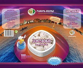
After probing various directions, we stopped on a concept derived from the logo idea: a table (sort of) placed in a natural environment, with a white box, showing the product, on top of it. In this case, since the packaging is transparent, the actual product could be visible through the non-printed area inside the box (in the design samples this area is filled with product images for better visualization).
We made two variations of khinkali -- Traditional and Chopped (hence the big knife), and two of pelmeni -- Siberian (hence the frost) and Italian (hence the Venetian scenery). You probably noticed a cute goldfish chef holding a white fork -- I came up with this mascot somewhere in the process of making the package design demos. It was just a designer's whim, but the client liked it so much that the little guy got himself a permanent job.
This is only the beginning, as there are loads of Okros Tevzi products waiting in line to be rebranded and redesigned. So, until next!
Old Spice!
14 years ago


1 comments:
The blog or and best that is extremely useful to keep I can share the ideas
of the future as this is really what I was looking for, I am very comfortable and pleased to come here. Thank you very much.
earn to die 3| earn to die 6
earn to die 5| happy wheels
strike force heroes| slitherio
earn to die 5| good game empire |tank trouble 2 | earn to die game hot
Post a Comment